
Evaluation
My media product has used and has conveyed a range of effective conventions used in magazines. However there are many different characteristics that are isolating my magazine from the others that have been presented to me. For instance on the front page of my magazine I used a bold title block ‘UK OVERPASS’I Included a attractive central image with text implemented across the lower part of the image. Which is called the anchorage text ’UNSTOPPABLE’ I also enclosed puffs which expresses what is included inside the magazine. I also used puffs to convey my artist’s name and I used this to indicate the conventions of magazines. One other aspect I noticed with magazines was that they used on average three colours and that is what I have maintained I used the colours green black and white. I also contained a consistence house style throughout my front cover using the same font and the same colours .However I didn’t use the same font size because it would then express that everything on the page has the same significance and importance the to magazine. To Enhance and deepen my development of my magazine I hadn’t used a plain background which most magazines have done in the past and present in my magazine I have purposely used a background of my own which surrounded him with a greenish background of nature. I was trying to portray that rap isn’t all about darkness and chaos but however have a gentle earthly aspect to it, I don’t think I have used many conventions on my front cover of my magazine so I would admit that I haven’t challenged it enough .However this has come as an advantage so it don’t look much different and consumers wouldn’t be bemused by a strange looking front cover. I used a green background so it would have a more appealing am more attractive look upon it and not the usual gloomy doll and dark as the other rap magazine. However inside my magazine I have kept the dark look which is evidently shown in my pictures on my blog using black and white images and colour fonts I didn’t want my magazine to be alienated from the rest. On the other hand I have given my readers a different reason to pick up my magazine but also given them the same reason they love to pick up a rap magazine.
My magazine targets a particular social group which is predominantly my target audience. it aims to represent males between the ages of 15-30 that live in the UK furthermore it is mainly for those that are not so wealthy as readers of more expensive magazine. My feature article shows and portrayed the type of audience I wanted to attract .A boy from one of the most violent areas of London Hackney has from up to avoid the trouble and become a ‘star from the hood’. Which could be a form of inspiration for many young troubled readers I have used my feature article to suck in readers to create a sense of belonging and understanding between writer and reader I have used direct mode of address to almost call out my readers that if this young boy can make it make it why cant they. The advantage of getting the connection of the people allows them to become regular readers I haven’t challenged conventions of other magazines due to the fact that I am targeting males which would be normal and original for a rap magazine.
During the process of constructing this project I have leant about the advantages of blogging and Photoshop. I have used Photoshop in my previous year however I have leant more and developed and enhance my skills using the programme. I have demonstrated in my magazine work things I have known and leant this year. For example resizing and moving, fading, spraying, tool of crop, black and white tool and placing in front and behind other items to serve different effects and purposes .I have also shown how to use glowing effects and shadowing effects. All these tools have been very useful to me making my magazine a successful one too. Blogging was the second advantage I had it was helping me to gather information I needed to stay up to date and I also got a general feed back. Using the poll to allow people to vote for the best title block also comments on my work that I posted allowing me to improve everything. These comments would come from my following class mate’s and my teacher. This was very helpful I have also tried to use the blog to a larger extent by learning how to use the dashboard which would allow inserting pictures and YouTube links. It also helped me edit my work and removed unwanted items. I have used other things like illustrator and leant the basics however I prefer Photoshop because it comes more natural to me. It is easier and gave me a better finishing product and a better result. Photoshop was used throughout the process of making my magazine.
The audience for my magazine are 15-30 aged males that live in the UK and have a strong interest in rap music. Also have an interest fashion and unheard up coming star I have chosen this type of audience because their isn’t many rap music magazines the only on I could think of from the top on my head was’THESOURCE’magzine.so thereis space for my magazine. furthermore the competition would be as great as other magazine genres every rap music magazine would, should be targeted at males my magazine would be distributed mostly in the UK the city of London where most males could connect with the message I am trying to send. However by having an different and a less thuggish looking magazine other social groups may pick it up so they will also be welcome to read and get connected. Other magazines use the same idea with different types of images ‘THESOURCE’
To Attract my target audience I used a bold and powerful title block and by using’UK’ also expressed its all about the UK and would attract more people. Because of the title block it conveys a rap genre however by using green white and black it implies different things to the audience. It may be a male magazine but doesn’t forbid females from reading it the picture I used has expressed a direct mode of address in order to connect with the audience at first sight. The font I used ‘UK OVERPASS’ I found it on www.1001fonts.co.uk as it portrayed the thuggish genre and the theme I wanted to express. It also makes it easier for the audience to identify what type of magazine it is it also invites them to pick it up. I have allowed my magazine to be very affordable due to the audience I want to attract, it is clearly stated at the top left corner .the reason for this is because my readers wouldn’t be coming from a rich background or rich society.
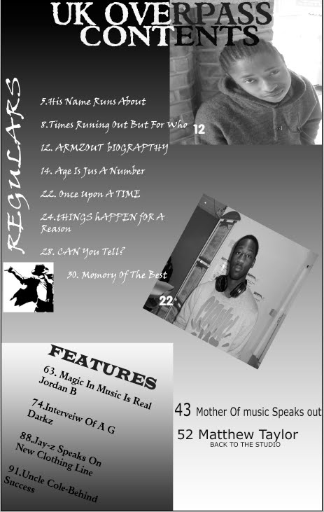
In order for me to construct my layout I have analysed many magazines and emulated their front covers and articles. This influenced me to make and take a more effective and confident approach to making my magazine layout. I realised how important the house style was and took time to choose how to create it. The colour was also another important aspect to my magazine. in some parts of my magazine I used black boxes saying”EXCULSIVE” to allow it to stand out more and show importance to it and to show the conventionality of magazines. To conclude I have learnt how to use layout and realized the important of layout conventions.
As I sit back and look at my prelimary task I feel that I have learnt a good amount on the journey and build up to my final tasks. For my images, I arranged a photo shoot with one of my close friends using different shots e.g. close-up, low angle mid-shot high angle etc. I also had different locations where I was taking these pictures after the pictures where taken to look more attractive I edited them and changed the colour levels and made the image stand out much more. I cropped and resized my image and changed it to a black and white image.
Having previously done research on publishing institutions, I am hoping that "IPC Media" would be the media institution to distribute my magazine, which is known for publishing both niche and mainstream magazines. I have chosen this; it has work with great magazines, such as 'NME' and would therefore have experience and knowledge on this matter. It is also relevant to note that over 44% in the UK read an IPCMedia magazine, which opens the door for my magazine to a wider audience as perhaps previous IPCMedia magazine readers would try reading my magazine, 'Fusion.' Furthermore, this publishing company could assist in further plans of making a website or a radios
Throughout this project I have learnt to attract the audience through the colours I use the central image and the font and size of my title. Also the price of my magazine would also be very effective in the attraction of my magazine I have been able to attract the audience I have chosen. I have noticed that other magazines have helped me massively in the process in making a successful magazine.
Tuesday, 4 May 2010


Thursday, 22 April 2010


Thursday, 18 March 2010

 The artist featured in this article is the amazing Cheryl Cole which had an amazing career with girls group girls aloud and now also everyone’s favourite judge on a Saturday night the X Factor.which suggests that the target audience are teenagers interested pop and Rock which fits in with the age group 19 – 24 year olds as its target audience. The type of language used in the article mixed combination of formal and informal language the language is not to sophisticated which makes it is very easy to understand. This conveys that the article targets audience which have a decent understanding of the English language and a good standard of reading ability it is also mixed with different levels of English vocabulary which would also appeal to a wider range of audience those with a higher and not so English understanding. The artist featured in this article is Cheryl Cole she in this article is used to draw the attention for more people to pick up the magazine predominately males.
The text is an interview and is structured in paragraphs the voice of the interviewer is formal and academic. However this is contrasted with Cheryl Cole’s colloquial dialogue that appears very genuine and down-to-earth, particularly phrases such as ‘Crap’ and isn’t scared to speak the truth. This difference in language would attract the audience as it would emphasize honest attitude of Cheryl Cole , allowing them to like her because she shows that she is very truthful and straight forward. background information that is significant for the reader to know to ensure they comprehend the points Cheryl makes in her interview. There are sections of the article that carry a humorous tone to engage the reader, such as ‘we cannot put that crap out its something busted would do‘. This would please the audience and persuade them to continue reading the general tone of the article addresses the reader as an informed intelligent fan. The article is set out this way to appeal to the some what intellectually male audience.
The article consists of many quotations by Cheryl Cole’s the text is clear to read, not bold, but still contrasted from the white background. The colours of black and red are clear to read the colours are reiterated as red black and white to establish the power she has. Black represents the music-style of the artist as well of the magazine There is bold letter C that initiates the change of topic in the article which is bright read in a white background which suggests that it was something that the magazine wanted the audience to identify. The text for the titles is arranged normally which could suggest that it’s a article that has no hidden messages and structured in a mature and ordered manner which could suggest her character. The actual article information is arranged in columns to add a sense of formality to it and abide by the unspoken rules of layout for magazines.
Cheryl Cole is presented as being this rough strong woman and also expressed as a ‘Rock chick’ in both images shown in the magazine. About half of the article is dominated by images of Cheryl Cole, again to emphasize her great sex appeal and show her in a ‘rockstar’ light ‘I don’t know what I look like any more’ is very ambiguous it could suggest that she don’t know who she as a person is however it could also convey that she is confused about her image her emotions and life style identity. This anchorage text has a very meaningful effect to the magazine and article and would draw many people into what she could be meaning. The main image is a mid-shot of Cheryl Cole is in direct form of address with the reader which is evident from the strong eye-contact but also in a devilish tone . Her shadowy appearance reflects the image on the front cover of the magazine, however this contact is a stern one perhaps to show her fear confusion and uneasiness with her emotions. The other image Q has taken this ‘new image’ idea and made her into a rockstar she looks comfortable more fierce and powerful.


Friday, 5 March 2010


Thursday, 25 February 2010


Wednesday, 24 February 2010

The colours are also very bold which is something that the readership seeks as they search for who they really are. The title is also pronounced 'Enemy' which connotes the readership attempting to 'stick it to the man’; it also suggests that the magazines enemy is popular culture, with this being the same enemy as the readership. The puffs also suggest that the readership will know about indie music and non-mainstream music; you wouldn't expect a fan of The Saturdays to read this magazine. The magazine follows a red, white and black colour theme with the title block following suit. This gives the reader the idea of mystery and danger, something that Gerrard Way also wants to demonstrate. The framing of the shot is a long-shot that shows his entire body; this is to show that perhaps he was in motion when the picture was taken to echo the chaos of the music and to emphasize his body language. His left-faced body position could symbolise the left-faced music acts, not just punk and rock; again to subtly entice both punk lovers and new-genre fanatics. His edgy haircut and dark make-up could reflect his character; it makes him appear like a Vampire. This is strengthened by his facial expression and studio lighting. The colour theme of this cover is black, red and white. These are very dominant and powerful colours that would appeal to the male target audience; they also fit in with the consistent colours of the title block to compose the magazine cover and glue all the factions together using the same colour theme.
Friday, 5 February 2010


Monday, 1 February 2010


Thursday, 28 January 2010

The title of the magazine is ‘Q’ The Q magazine is aimed and directed at mostly hip-hop loving fans. Mainly aged 14-40 the title and the logo of the magazine in bold bright red which draws readers in and make it clear for consumers to identify the magazine. The red background and the white font allow the Q to stand out more which brings a strong title affect. The title is placed at the highest point of the magazine to convey that it is the front cover this is also done so viewers and readers can see this from far when it is placed on the shelf.

‘The source’ title is also a title that is used to draw the attention of readers with its bright yellow colour and it dark black background allows the magazine to become impossible to miss. The font size is huge which adds to the effect of it being unfishable and very clear to see. The dark yellow and the black back ground beings a sense of gloom but makes it sound very loud at the same time the lines below the font bring that sense of importance to the title.
This title block is very clear and in your face which was used to catch the eyes of magazine readers. There are various ways that this title block achieves this. One point is the size of the font which is very bold and large which would predominately convey to the readers that it is the most important part of the magazine. Another way this title block is clearly visible and draws attention would be the bright red colour that is used the red is emphasised more strongly by the background which is black which helps it stand out more. The title is very loud and aggressive in a sense this would normally be placed at the top of the magazine to help be more noticeable to readers.

This title block is very clear and in your face which was used to catch the eyes of magazine readers. There are various ways that this title block achieves this. One point is the size of the font which is very bold and large which would predominately convey to the readers that it is the most important part of the magazine. Another way this title block is clearly visible and draws attention would be the bright red colour that is used the red is emphasised more strongly by the background which is black which helps it stand out more. The title is very loud and aggressive in a sense this would normally be placed at the top of the magazine to help be more noticeable to readers.

Subscribe to:
Posts (Atom)